TDK SensEI
Three Companies, One Intelligent Interface
Designing the user experience for TDK's edge AI sensor platform — expressing the depth of three world-class sensing and ML engineering lineages as a single coherent interface for industrial predictive maintenance.
 TDK SensEI · Industrial IoT Sensor Intelligence
3→1
Acquired companies unified into a single UX
CES 2024
Innovation Award — TDK SensEI edgeRX
4-Level
Cross-platform alert severity normalization
Context
Three Technology Lineages, One Product Vision
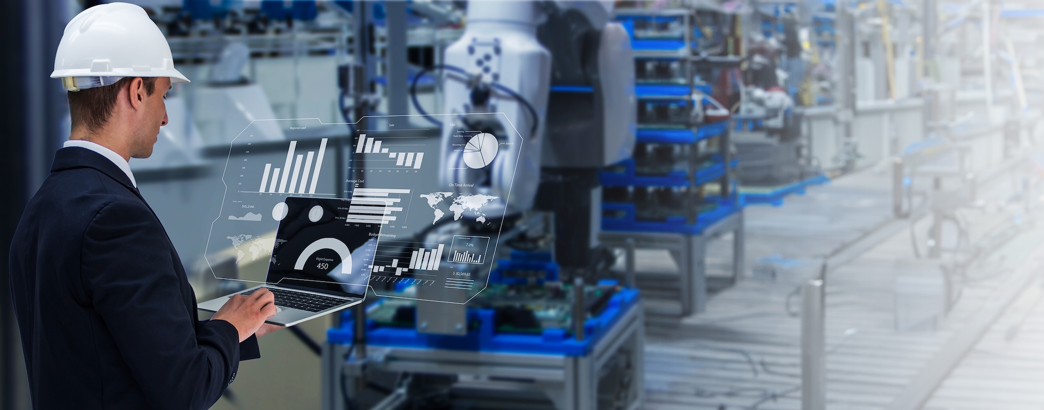
TDK Corporation is one of the world's leading electronic components manufacturers — a $15B company whose acquisitions include InvenSense (the motion-sensing company inside every smartphone, acquired for $1.3B), Qeexo (on-device ML), Micronas, and Chirp Microsystems. TDK SensEI was the corporate venture that brought these capabilities together under one AI initiative: a predictive maintenance and machine health monitoring platform for industrial IoT.
The technical depth was extraordinary — three world-class sensor and ML engineering teams, each with distinct domain expertise, now operating as one platform. The opportunity was to express that combined capability as a single unified experience: common metadata vocabulary, consistent alert taxonomy, and a shared presentation layer across all three sensor platforms. I joined as UX strategy consultant with the mandate to design that unification layer.
Backend data harmonization would take years. The product needed to ship now. My approach: design a UX normalization layer that made edgeRX feel like a single, coherent platform from Day 1, independent of backend architecture.
The Work
UX Normalization as Strategy
The core design insight was that UX coherence and data coherence are independent problems. A well-designed presentation layer can make heterogeneous data feel unified to users long before engineers solve schema compatibility at the API layer. The UX normalization layer I designed did three things simultaneously.
First, it defined a progressive disclosure model for three distinct user types: a single 0–100 machine health score for plant managers who need status at a glance; per-sensor summary cards with sparkline trend lines for reliability engineers who need to prioritize maintenance queues; and full domain-specific visualization — FFT spectral analysis, raw waveforms, time-series correlation — for domain specialists who need to diagnose root cause. The same underlying data, three completely different interfaces, each appropriate to the decision being made.
Second, it unified alert taxonomy across all three sensor platforms into a consistent 4-level severity system (Normal / Watch / Warning / Critical), with standardized confidence display across all ML model outputs. An alert from InvenSense's vibration sensor and one from Qeexo's acoustic model would now look and behave identically in the interface — even though their underlying representations were different.
Third, it introduced cross-sensor correlation views that surfaced a single correlated insight from what previously appeared as three separate, unrelated alerts. A vibration anomaly, an acoustic emission pattern, and a temperature spike from three different sensors on the same machine became one "bearing fatigue likely within 72 hours" card — with a specific recommended action and the cost of action versus inaction.
Platform Partner Ecosystem
The UX normalization layer can ship independently of data standardization — making the product feel unified from Day 1.
Impact
Coherence Before Engineering Convergence
TDK SensEI edgeRX shipped as a coherent product to enterprise customers without waiting for backend unification — a timeline measured in months rather than years. The unified interface allowed sales and partnership conversations to happen around a single product story, not three separate technology pitches.
edgeRX was recognized with the CES 2024 Innovation Award — an independent validation that the platform had reached a level of coherence and capability that distinguished it in the industrial IoT category. The award carried particular weight given the competitive field of industrial AI platforms at that edition of CES.
Reflection
What UX Can and Can't Solve
TDK reinforced a principle that shows up throughout enterprise software work: the user experience layer and the data architecture layer operate on different timelines, and the most dangerous thing you can do is make one block the other. Users experience the presentation layer. Engineering owns the data layer. They can evolve independently, as long as the interface contracts between them are well-defined.
The harder lesson was about the scope of UX normalization. A presentation layer can unify how things look and feel — alert taxonomy, confidence display, interaction patterns. It cannot fix underlying model quality differences, sensor calibration inconsistencies, or data freshness gaps. When those gaps were exposed in edge cases during testing, the design had to be honest about them: rather than hiding uncertainty behind a unified confidence score, the interface surfaces it — flagging when a reading comes from a lower-confidence model, or when sensor data is stale. Confidence calibration, as I've written about elsewhere, is a design problem as much as an engineering one.
Recognition
- CES 2024 Innovation Award — TDK SensEI edgeRX
- NVIDIA Inception Program Partner
- AWS Industrial IoT Partner
- EdgeAI Foundation Member